How to Create Modern Cards in Chakra UI & React JS ⚡️

Sometimes creating a great UI requires, not just time, but attention as well. Even when it comes to some cards, the attention to structure, spacings, color palette, and so on... is more than important.
These days, we can safely say that cards have become a design trend & staple across websites and mobile app UIs, we have examples from big companies like Revolut, Apple & Google that use interactive & modern cards on their websites and apps to give their customers and users a great experience in using their solutions!
So, when we start designing & developing a card we need to take into consideration some important aspects:
- The card content should be very compact and intuitive, so we need to keep it in a single card structure.
- The whole card should be very easy to read and use. This aspect makes the difference between a great and a bad UI & UX. So we need to pay attention to making it clean and airy (design tip: don't be afraid to use whitespace, use it as much as you can).
- The card should have just the important elements that will expose the information, as I said above, we need to keep the card clean & airy. For example, a CTA card should contain a title, subtitle, maybe an image, and a CTA button that will make the action.
One more important aspect that defines the popularity of UI Cards is that they facilitate responsive UI design, they can easily scale down to any device resolution due to their squared shape that fits perfectly in any grid structure.
Let's get straight to our cards examples!
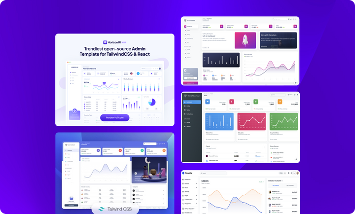
In today's example, we will make three simple cards updated to the latest UI trends. We've taken some design inspiration from Horizon UI React cards, you can see more awesome free react cards like this on their website.
Great, let's code them!
As you already saw, the React JS library that we are going to use today to build our beautiful cards is Chakra UI. Also, we are going to get some help from tools such as Chakra theme tools & React icons.
First of all, let's install Chakra UI & its above add-ons:
npm i @chakra-ui/react @chakra-ui/theme @chakra-ui/theme-tools react-iconsAfter this, we need to make a style.js file and type the following styles:
// @src/theme/styles.js

import { mode } from "@chakra-ui/theme-tools";

export const globalStyles = {
  colors: {
    gray: {
      700: "#1f2733",
    },
    navy: {
      50: "#d0dcfb",
      100: "#aac0fe",
      200: "#a3b9f8",
      300: "#728fea",
      400: "#3652ba",
      500: "#1b3bbb",
      600: "#24388a",
      700: "#1b254b",
      800: "#111c44",
      900: "#0b1437",
    },
    brand: {
      50: "#cbbff8",
      100: "#876cea",
      200: "#582CFF",
      300: "#542de1",
      400: "#7551FF",
      500: "#4318FF",
      600: "#300eaa",
      700: "#1c0377",
      800: "#130156",
      900: "#0e0042",
    },
  },
  styles: {
    global: (props) => ({
      body: {
        overflowX: "hidden",
        bg: mode("gray.50", "#1B254B")(props),
      },
      html: {
        fontFamily: "Helvetica, sans-serif",
      },
    }),
  },
};
Great! In the components folder in /theme, we modified various Chakra UI components like <Button> or <Badge>, to use them we need to make a special folder with all styles files for each component we have (badge.js, button.js & breakpoints.js)!
Make a special file for the components below:
badge.js
// @src/theme/components/badge.js

export const badgeStyles = {
    components: {
        Badge: {
            sizes: {
                md: {
                    width: "65px",
                    height: "25px"
                }
            },
            baseStyle: {
                textTransform: "capitalize"
            }

        }
    }
}button.js
// @src/theme/components/button.js

import { mode } from "@chakra-ui/theme-tools";
export const buttonStyles = {
  components: {
    Button: {
      variants: {
        primary: {
          fontSize: "10px",
          bg: "blue.400",
          color: "#fff",
          _hover: { bg: "blue.300" },
          _focus: { bg: "blue.300" },
          _active: { bg: "blue.300" },
        },
        navy: {
          fontSize: "10px",
          bg: "navy.900",
          color: "#fff",
          _hover: { bg: "navy.900" },
          _focus: { bg: "navy.900" },
          _active: { bg: "navy.900" },
        },
        "no-effects": {
          _hover: "none",
          _active: "none",
          _focus: "none",
        },
        danger: () => ({
          color: "white",
          bg: "red.500",
          fontSize: "10px",
          _hover: "red.400",
          _focus: "red.400",
          _active: "red.400",
        }),
        outlined: (props) => ({
          color: mode("blue.400", "white")(props),
          bg: "transparent",
          fontSize: "10px",
          border: "1px solid",
          borderColor: { bg: mode("blue.400", "white")(props)},
          _hover: { bg: mode("blue.50", "transparent")(props) },
          _focus: { bg: mode("blue.50", "transparent")(props) },
          _active: { bg: mode("blue.50", "transparent")(props) },
        }),
        dark: (props) => ({
          color: "white",
          bg: mode("gray.700", "blue.500")(props),
          fontSize: "10px",
          _hover: { bg: mode("gray.700", "blue.500")(props) },
          _focus: { bg: mode("gray.700", "blue.600")(props) },
          _active: { bg: mode("gray.700", "blue.400")(props) },
        }),
        light: (props) => ({
          color: mode("gray.700", "gray.700")(props),
          bg: mode("gray.100", "white")(props),
          fontSize: "10px",
          _hover: { bg: mode("gray.50", "white")(props) },
          _focus: { bg: mode("gray.50", "white")(props) },
          _active: { bg: mode("gray.50", "white")(props) },
        }),
      },
      baseStyle: {
        fontWeight: "bold",
        borderRadius: "8px",
        fontSize: "10px",
      },
    },
  },
};After we have modified general styles, it would also be helpful to set other breakpoints for responsive accuracy. Create a breakpoints.js file with the following code:
breakpoints.js
// @src/theme/foundations/breakpoints.js

import { createBreakpoints } from "@chakra-ui/theme-tools";

export const breakpoints = createBreakpoints({
  sm: "375px",
  md: "768px",
  lg: "1024px",
  xl: "1440px",
  "2xl": "1680px",
});
Good, now we need to make a new file called theme.js where we need to import and add all styles to the theme we'll use in index.js. This will help define general styles for our awesome cards!
// @src/theme/theme.js

import { extendTheme } from "@chakra-ui/react";
import { globalStyles } from "./styles";
import { breakpoints } from "./foundations/breakpoints";
import { buttonStyles } from "./components/button";
import { badgeStyles } from "./components/badge";
export default extendTheme(
  { breakpoints }, // Breakpoints
  globalStyles, // Global styles
  buttonStyles, // Button styles
  badgeStyles, // Badge styles
);
After this, in index.js, add the theme to the <ChakraProvider> component:
// @src/index.js

import React from 'react';
import ReactDOM from 'react-dom';
import App from 'App';
import { ChakraProvider } from "@chakra-ui/react";
// Custom Chakra theme
import theme from "theme/theme.js";

ReactDOM.render(
  <ChakraProvider theme={theme} resetCss={false} position="relative">
    <App />
  </ChakraProvider>,
  document.getElementById("root")
);
Amazing! Let's start coding the structure of our Chakra UI + React cards! ⚡️
All we need to do is to make a special file for each of them and paste the below code of them:
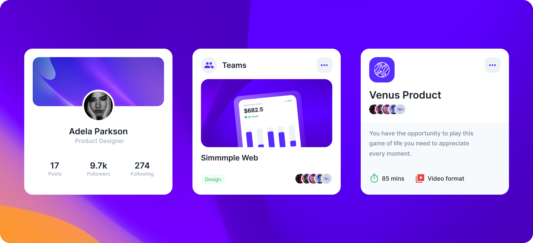
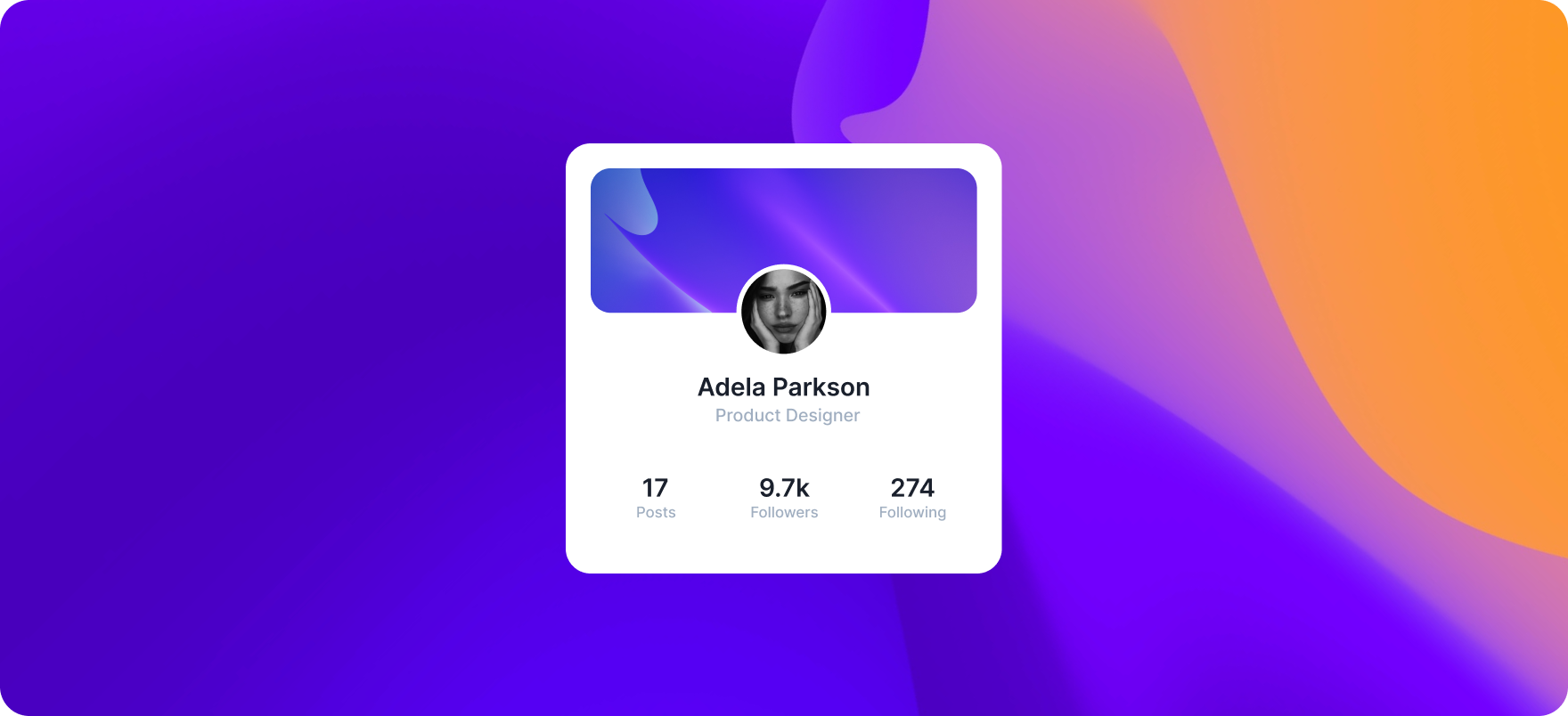
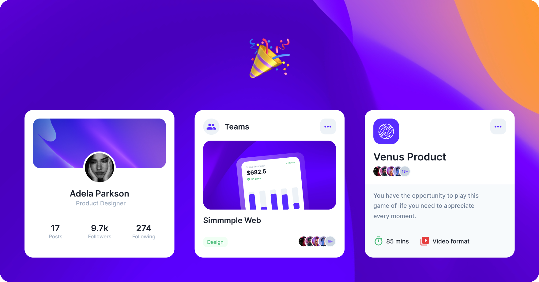
Chakra UI - Profile Card
// @src/components/Profile.js

import React from "react";
// Chakra imports
import { Flex, Image, Text, useColorModeValue } from "@chakra-ui/react";

function Profile() {
  let boxBg = useColorModeValue("white !important", "#111c44 !important");
  let mainText = useColorModeValue("gray.800", "white");
  let secondaryText = useColorModeValue("gray.400", "gray.400");

  return (
    <Flex
      borderRadius='20px'
      bg={boxBg}
      p='20px'
      h='345px'
      w={{ base: "315px", md: "345px" }}
      alignItems='center'
      direction='column'>
      <Image
        src='https://i.ibb.co/xmP2pS6/Profile.png'
        maxW='100%'
        borderRadius='20px'
      />
      <Flex flexDirection='column' mb='30px'>
        <Image
          src='https://i.ibb.co/B3gYTYs/Profile-Image.png'
          border='5px solid red'
          mx='auto'
          borderColor={boxBg}
          width='68px'
          height='68px'
          mt='-38px'
          borderRadius='50%'
        />
        <Text
          fontWeight='600'
          color={mainText}
          textAlign='center'
          fontSize='xl'>
          Adela Parkson
        </Text>
        <Text
          color={secondaryText}
          textAlign='center'
          fontSize='sm'
          fontWeight='500'>
          Product Designer
        </Text>
      </Flex>
      <Flex justify='space-between' w='100%' px='36px'>
        <Flex flexDirection='column'>
          <Text
            fontWeight='600'
            color={mainText}
            fontSize='xl'
            textAlign='center'>
            17
          </Text>
          <Text color={secondaryText} fontWeight='500'>
            Posts
          </Text>
        </Flex>
        <Flex flexDirection='column'>
          <Text
            fontWeight='600'
            color={mainText}
            fontSize='xl'
            textAlign='center'>
            9.7k
          </Text>
          <Text color={secondaryText} fontWeight='500'>
            Followers
          </Text>
        </Flex>
        <Flex flexDirection='column'>
          <Text
            fontWeight='600'
            fontSize='xl'
            color={mainText}
            textAlign='center'>
            274
          </Text>
          <Text color={secondaryText} fontWeight='500'>
            Following
          </Text>
        </Flex>
      </Flex>
    </Flex>
  );
}
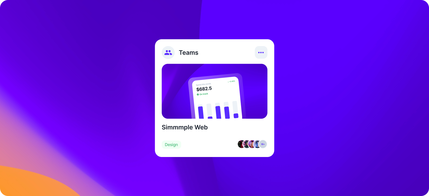
export default Profile;Chakra UI - Teams Card
// @src/components/Teams.js

import React from "react";
// Chakra imports
import {
  Avatar,
  AvatarGroup,
  Badge,
  Flex,
  Button,
  Icon,
  Image,
  Text,
  DarkMode,
  useColorModeValue,
} from "@chakra-ui/react";
// Assets
import { MdPeople } from "react-icons/md";
import { IoEllipsisHorizontalSharp } from "react-icons/io5";

function Teams() {
  let boxBg = useColorModeValue("white !important", "#111c44 !important");
  let mainText = useColorModeValue("gray.800", "white");
  let iconBox = useColorModeValue("gray.100", "whiteAlpha.200");
  let iconColor = useColorModeValue("brand.200", "white");
  return (
    <Flex
      borderRadius='20px'
      bg={boxBg}
      p='20px'
      h='345px'
      w={{ base: "315px", md: "345px" }}
      alignItems='center'
      direction='column'>
      <Flex w='100%' mb='18px'>
        <Flex
          w='38px'
          h='38px'
          align='center'
          justify='center'
          borderRadius='50%'
          me='12px'
          bg={iconBox}>
          <Icon w='24px' h='24px' as={MdPeople} color={iconColor} />
        </Flex>
        <Text
          my='auto'
          fontWeight='600'
          color={mainText}
          textAlign='center'
          fontSize='xl'
          me='auto'>
          Teams
        </Text>
        <Button
          w='38px'
          h='38px'
          align='center'
          justify='center'
          borderRadius='12px'
          me='12px'
          bg={iconBox}>
          <Icon
            w='24px'
            h='24px'
            as={IoEllipsisHorizontalSharp}
            color={iconColor}
          />
        </Button>
      </Flex>
      <Image
        src='https://i.ibb.co/KVwmVGW/Teams-Image.png'
        maxW='100%'
        borderRadius='20px'
        mb='10px'
      />
      <Text
        fontWeight='600'
        color={mainText}
        textAlign='start'
        fontSize='xl'
        w='100%'>
        Simmmple Web
      </Text>
      <Flex mt='auto' justify='space-between' w='100%' align='center'>
        <DarkMode>
          <Badge
            borderRadius='9px'
            size='md'
            colorScheme='green'
            color='green.400'
            textAlign='center'
            display='flex'
            justifyContent='center'
            alignItems='center'>
            Design
          </Badge>
        </DarkMode>
        <AvatarGroup
          size='sm'
          max={4}
          color={iconColor}
          fontSize='9px'
          fontWeight='700'>
          <Avatar src='https://i.ibb.co/CmxNdhQ/avatar1.png' />
          <Avatar src='https://i.ibb.co/cFWc59B/avatar2.png' />
          <Avatar src='https://i.ibb.co/vLQJVFy/avatar3.png' />
          <Avatar src='https://i.ibb.co/8mcrvQk/avatar4.png' />
          <Avatar src='https://i.ibb.co/CmxNdhQ/avatar1.png' />
          <Avatar src='https://i.ibb.co/cFWc59B/avatar2.png' />
          <Avatar src='https://i.ibb.co/vLQJVFy/avatar3.png' />
          <Avatar src='https://i.ibb.co/8mcrvQk/avatar4.png' />
        </AvatarGroup>
      </Flex>
    </Flex>
  );
}

export default Teams;
Chakra UI - Product Card
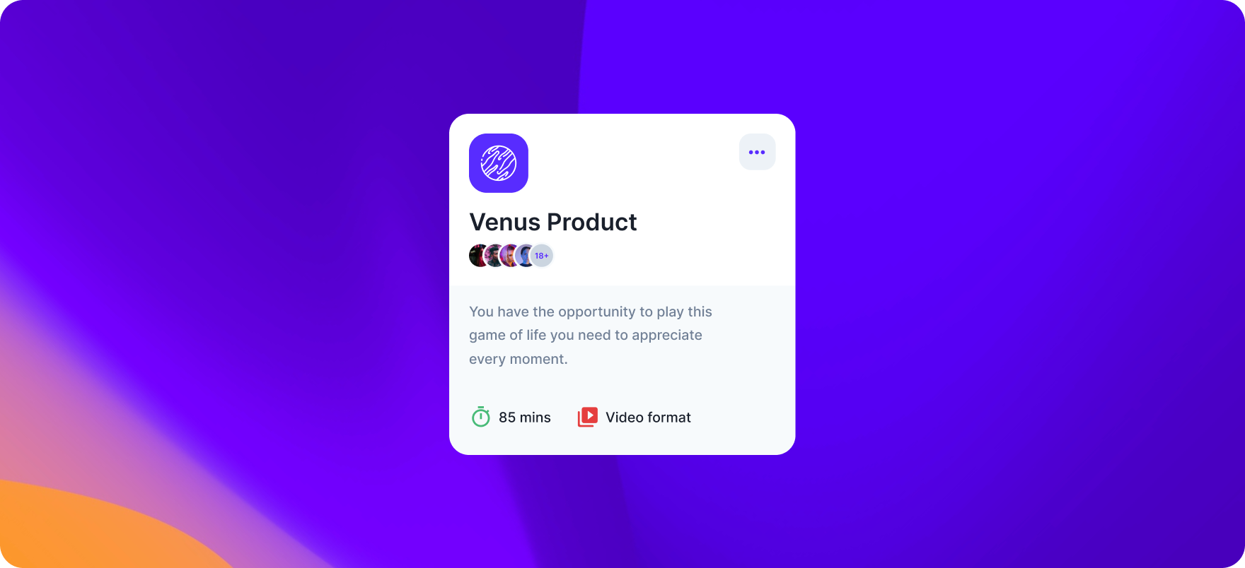
// @src/components/Product.js

import React from "react";
// Chakra imports
import {
  Avatar,
  AvatarGroup,
  Box,
  Flex,
  Button,
  Icon,
  Image,
  Text,
  useColorModeValue,
} from "@chakra-ui/react";
// Assets
import { MdTimer, MdVideoLibrary } from "react-icons/md";
import { IoEllipsisHorizontalSharp } from "react-icons/io5";

function Product() {
  let boxBg = useColorModeValue("white !important", "#111c44 !important");
  let secondaryBg = useColorModeValue("gray.50", "whiteAlpha.100");
  let mainText = useColorModeValue("gray.800", "white");
  let iconBox = useColorModeValue("gray.100", "whiteAlpha.200");
  let iconColor = useColorModeValue("brand.200", "white");
  return (
    <Flex
      borderRadius='20px'
      bg={boxBg}
      h='345px'
      w={{ base: "315px", md: "345px" }}
      direction='column'>
      <Box p='20px'>
        <Flex w='100%' mb='10px'>
          <Image src='https://i.ibb.co/ZWxRPRq/Venus-Logo.png' me='auto' />
          <Button
            w='38px'
            h='38px'
            align='center'
            justify='center'
            borderRadius='12px'
            me='12px'
            bg={iconBox}>
            <Icon
              w='24px'
              h='24px'
              as={IoEllipsisHorizontalSharp}
              color={iconColor}
            />
          </Button>
        </Flex>
        <Box>
          <Text fontWeight='600' color={mainText} w='100%' fontSize='2xl'>
            Venus Product
          </Text>
          <AvatarGroup
            size='sm'
            max={4}
            color={iconColor}
            fontSize='9px'
            fontWeight='700'>
            <Avatar src='https://i.ibb.co/CmxNdhQ/avatar1.png' />
            <Avatar src='https://i.ibb.co/cFWc59B/avatar2.png' />
            <Avatar src='https://i.ibb.co/vLQJVFy/avatar3.png' />
            <Avatar src='https://i.ibb.co/8mcrvQk/avatar4.png' />
            <Avatar src='https://i.ibb.co/CmxNdhQ/avatar1.png' />
            <Avatar src='https://i.ibb.co/cFWc59B/avatar2.png' />
            <Avatar src='https://i.ibb.co/vLQJVFy/avatar3.png' />
            <Avatar src='https://i.ibb.co/8mcrvQk/avatar4.png' />
          </AvatarGroup>
        </Box>
      </Box>
      <Flex
        bg={secondaryBg}
        w='100%'
        p='20px'
        borderBottomLeftRadius='inherit'
        borderBottomRightRadius='inherit'
        height='100%'
        direction='column'>
        <Text
          fontSize='sm'
          color='gray.500'
          lineHeight='24px'
          pe='40px'
          fontWeight='500'
          mb='auto'>
          You have the opportunity to play this game of life you need to
          appreciate every moment.
        </Text>
        <Flex>
          <Flex me='25px'>
            <Icon as={MdTimer} w='20px' h='20px' me='6px' color='green.400' />
            <Text color={mainText} fontSize='sm' my='auto' fontWeight='500'>
              85 mins
            </Text>
          </Flex>
          <Flex>
            <Icon
              as={MdVideoLibrary}
              w='20px'
              h='20px'
              me='6px'
              color='red.500'
            />
            <Text color={mainText} fontSize='sm' my='auto' fontWeight='500'>
              Video Format
            </Text>
          </Flex>
        </Flex>
      </Flex>
    </Flex>
  );
}

export default Product;Congratulations! 🎉
Great! Now in our App.js, we're going to import the card components that we created! The imports should look like this:
// Components Import
import Product from "./components/Product";
import Profile from "./components/Profile";
import Teams from "./components/Teams";
Conclusions & Resources ⭐️
In this article, we've been able to build complete and fully responsive cards using Chakra UI. I hope you found it helpful and interesting!
Here you will find the .zip file with today's project that contains the cards above!
Also, I really recommend to take a look and try Horizon UI, you will find more awesome cards like in this article, modern charts, and many other amazing UI elements. You will find them in a beautifully functional admin dashboard that is responsive to all devices! And is free & open-source!⚡️
Thanks for reading!

Frequently asked questions
Where can I find more Chakra UI templates?
Top websites with Chakra UI templates and themes you should use in 2022:
Where can I find Chakra UI components?
Top websites where you can find the best Chakra UI components: